Visual Diffs With Diffux
Are you worried that your CSS changes will break the current design in unexpected ways? Do you want to show a designer a page you’ve been working on, before and after your changes? Do you want to be able to quickly look back at how things looked a month or a year ago?
Diffux [dɪˈfjuːz] is a tool that generates and manages visual diffs of web pages, so that you can easily see even the subtlest effects of your code modifications.
Visualizing change
A scary part of writing CSS on a large website is that when changing styles on one page, you might unknowingly break styles on another page. This action at a distance problem is something that most people who write CSS have come across. With this in mind we came to conclude that an automated diff tool that compared the look of a page before and after a change would be very helpful. Manually comparing page after page is just too time-consuming.
We use Diffux to diff a large number of pages on our website (causes.com) after every deploy. It has helped us find style regressions and bugs that we would have never found with a manual review process.
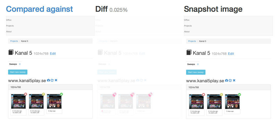
An example Diffux diff
This is an example of a before and after snapshot of the Diffux UI (Diffux runs in a browser, so we use it internally in the project too – Inception style). The snapshot on the left is before our change, the snapshot on the right is after our change and in between we have the generated visual diff of the two snapshots. First, try to spot the difference by just looking at the before and after snapshots. It’s almost impossible. Now look at the visual diff and look for anything in magenta. It reveals that the icons in the top right corner of the thumbnails have changed slightly. This commit message explains more about what changed.
Support for responsive diffs
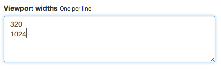
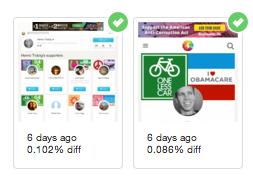
Causes.com is a responsive website which means that it adapts to the available screen size of your device. On mobile, you’ll be presented with a (mostly) one-column layout. On your laptop, we use more of your screen estate by using a sidebar and flowing things left-to-right. This is why Diffux allows you to specify a list of viewport widths to use when taking snapshots. Diffs are generated for each viewport, so you can easily see what effect your changes had on a page in many screen sizes.
Setting to specify different viewport widths:
Two snapshots of the same URL with different viewport widths (1024 and 320 pixels):
Alternatives
Before deciding to build Diffux, we scanned the open source market for some alternatives. Dpxdt looked promising, so we gave it a spin. It got the job done, but the project looked abandoned (6 month old PRs hadn’t received any attention, last commit was in August 2013) and we couldn’t get the test suite to run locally. Plus, Dpxdt is written in Python, and we are no Python experts. So there was a bit of a hurdle in debugging and adding functionality.
About
Diffux is released under the MIT License and is available on Github: https://github.com/trotzig/diffux