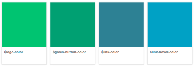
Showing Color Chips From Sass Variables
At Causes we like to make our code more maintainable by building reusable components. Part of this strategy includes assigning variable names to hex colors using Sass. This allows us to more easily reuse the same colors everywhere, which improves consistency and makes it easier to re-color the entire site when our design needs change.
To increase the visibility of these reusable components, we’ve been building out a collection of things that designers and engineers can reference, drop in to projects, and iterate upon. The code sits next to the rendered version, allowing people to easily see the implementation required to produce the result. We call this collection the component gallery. It helps us do more with less code, be more consistent, and iterate on global changes more easily and effectively.
When we started fleshing out the color variables we wanted to use throughout the site, it seemed natural to show these colors in the component gallery as Pantone color chips. That way, designers could reference the colors that we are using, we’d have a single place to see that all of the colors look great next to each other, and engineers could easily pluck variable names when implementing designs to match the mocks.

